F-Curve editor discussion

@jascha, and anyone else who would like to refine the info of this topic. As the last piece of the puzzle for a training series I am releasing before christmas, I am trying to dial in a clear way to explain the F-Curve editor. My understanding and usage of it is in this animated gif. I’ve always treated it along these lines for years.

FCurve_Explainer

My goal is to make it as easily understandable for a non technical artist, so I’d like to make sure I am not misleading or informing some aspect too wildly astray from the technical truth. I get that the transfer function is the core tech underneath, it’s that explaining some of that simply can be tricky. It drives Shader looks (color AND opacity), then there is parameter data based (vorticity, turbulence), masking data (fuel), as well as particle data. They all involve remapping input to output, but in different contexts so therefor different thinking is needed by the user.

Looking for opinions, as I need to complete this within the week pretty much to get edits exported, and marketing materials together.

1 Like

Yes, it’s all about remapping the values from a fluid channel to a different range of values. These target ranges are either color or opacity for shading or a force intensity in the case of turbulence.

The fluid channels usually have values in the range of 0 to 1-ish. That is, you can have values larger than 1.0, but since we must remap the channel values anyway, keeping them between zero and one makes sure you always know where your top end is.

The most commonly used remap is the one for color. It maps the fluid channel value (on the X axis) to a color gradient parameter (on the Y axis). The fire color mapping editor shows the color gradient as a column along the Y axis accordingly.
(Note that accordingly, the description in your GIF “Multipler values to inc/decrease the channel value” is not correct)

Most users, especially the less technical among them, would leave the histogram off and tweak the mapping based on the visual feedback.
If you have a trickier case of shading, the histogram can give you a bit of insight about the distribution of fluid channel values. For every channel value (again on the X axis) it shows you how much of the volume is filled with this value. For example, the fact that the blue, left end of the histogram has the highest peak, tells you that a large part of the volume is empty or has very low values.
It’s important to note that the Y axis of the histogram is not the same as the Y axis of the curve. The histogram Y axis is the volume fraction, while the curve Y axis is color gradient, opacity or turbulence intensity depending on which curve we’re looking at.
(Correction for the GIF: tilting the histogram on its side to align its Y axis (volume fraction) with the X axis (fluid channel value) is not correct.)

With this in mind, the histogram tells you, where your curve should be located horizontally. For example, if you have an A-shaped curve right of the red zone of the histogram, the A-shaped part of your curve will have no effect because none of the volume is filled with these high values. On the other extreme, if your curve maps the blue, left end to anything but zero, you’ll fill the entire container with something between a haze and a solid wall depending on the intensity.
The values in between those extremes are what you usually aim for. The histogram lets you know where on the X axis the majority of those values actually are.
It’s also interesting to see how the histogram changes over time, as channel values are changed by the simulation.

Something that has helped me as a reference to explain this topic to artists are color correction tools that many are familiar with from Photoshop or compositing apps. These tools use histograms and remapping curves in pretty much the same way. The added difficulty for volume shading is just that you don’t see the output of your curve as directly as in a 2D image.

1 Like

Thanks Jascha,

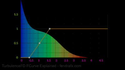
"The most commonly used remap is the one for color. It maps the fluid channel value (on the X axis) to a color gradient parameter (on the Y axis). The fire color mapping editor shows the color gradient as a column along the Y axis accordingly.

(Note that accordingly, the description in your GIF “Multipler values to inc/decrease the channel value” is not correct)"

I think I may have made a typo. Instead of “channel” value, I think I should have said “parameter” or “intensity” value. When I said channel I was referring to the input parameter value being remapped. Understandably, for the color context. As I type this I think I am also realizing my own mistake on understanding this interpretation. So in the case of the intensity context (say for Turbulence) the Y axis is not a multiplier then, it just remaps? Say a 2m intensity input value, and a curve Y axis value of 4…would result in 4m intensity value and not 16m correct? A curve Y axis value of 0.5 becomes 0.5m intensity value instead of 1m?

“For every channel value (again on the X axis) it shows you how much of the volume is filled with this value. For example, the fact that the blue, left end of the histogram has the highest peak, tells you that a large part of the volume is empty or has very low values.
It’s important to note that the Y axis of the histogram is not the same as the Y axis of the curve. The histogram Y axis is the volume fraction, while the curve Y axis is color gradient, opacity or turbulence intensity depending on which curve we’re looking at.
(Correction for the GIF: tilting the histogram on its side to align its Y axis (volume fraction) with the X axis (fluid channel value) is not correct.)”

So this double meaning in the graph, is exactly why I am trying to explain the two elements separately. That’s because every single question I’ve ever gotten from a user about the graph is how the curve and graph relate with the numbers. Everyone who asks me seems super confused to the relationship. Hence the hunt and peck approach to using the curve. Also my intension for rotating the histogram, wasn’t to match either of the X or Y numbers actually, it was meant to illustrate a simple isolated top down hierarchical view of the volume values from least (top) to most (bottom) like a pyramid. This visual also isn’t going to be out of context, it was just a visual to have available as I explain in app, side-by-side. I wanted to isolate each piece of the graph, so I can focus individually on what means what. This gif overall by itself may have given the wrong impression. Apologies. This is exactly why I ask and tested this out. :smiley:

So when you say volume fraction, are you meaning a percentage of the overall volume space? Does that fraction have a range as a reference? 0-1, 0%-100%? Or is it relative in the histogram, like the max value of the blue is the full container, then each color afterwards is the fraction of that value? Not as vital to explain this, but I am curious for my own reference.

“With this in mind, the histogram tells you, where your curve should be located horizontally. For example, if you have an A-shaped curve right of the red zone of the histogram, the A-shaped part of your curve will have no effect because none of the volume is filled with these high values. On the other extreme, if your curve maps the blue, left end to anything but zero, you’ll fill the entire container with something between a haze and a solid wall depending on the intensity.
The values in between those extremes are what you usually aim for. The histogram lets you know where on the X axis the majority of those values actually are.
It’s also interesting to see how the histogram changes over time, as channel values are changed by the simulation.”

Exactly as I understood it. Perfect.

“Something that has helped me as a reference to explain this topic to artists are color correction tools that many are familiar with from Photoshop or compositing apps. These tools use histograms and remapping curves in pretty much the same way. The added difficulty for volume shading is just that you don’t see the output of your curve as directly as in a 2D image.”

That makes sense.

Thanks again, for all the help, you’ve given on this too. It’s very appreciated.

Yes, correct.

This should indeed be visualized better in the curve editor (color-coding, additional annotations, etc). Using two Y axes is generally useful since you do want to correlate the two curves on the same X axis (as in the example below). I’ll look into improving the visualization for future versions.
two-y-axes

The unit of the histogram curve’s Y axis should be percent (0 to 1 would also work but is less clear. 0% to 100% is unambiguously a fraction). The highest point in the histogram curve is generally not 100%, though (unless the entire volume is filled with a single value). Instead, the sum of all histogram values would be 100%. For example, if you had one half of the volume filled with one value and the other half filled with a different value, the histogram would have two vertical line peaks that each go to 50%. On the other extreme, if every single voxel had a unique value, the histogram would be a horizontally flat line, parallel to the X axis very close to (but not at) 0%.

Sure, you’re welcome.

1 Like

Excellent! I appreciate all the clarification. I think I have a proper handle on it now. Thanks so much.